Color Psychology in Social Media: How to Improve Your Instagram Metrics with a Nice Palette

Why does a bold red restaurant interior make you feel hungrier? Why do women wearing monochrome apparel always look effortlessly chic and classy? Why is it so hard to tear your eyes away from Bill Murray’s orange beanie set against the blue sea in The Life Aquatic with Steve Zissou? And why do some Instagram feeds make you stop and gaze, while others feel chaotic and bizarre?
The answer isn’t black and white — it’s more complicated than that. It lies in one of the most fascinating powers of color — the ability to affect how we perceive things. On Instagram, the most visual of all social media, first impressions happen in a millisecond. And color plays a critical role in what feelings your brand or content evoke in customers.
In this article, we’ll explore how color influences mood, emotions, and decision-making in everyday life — and how you can apply this knowledge for Instagram marketing. Moreover, we’ll show you how to use the Instagram Profile Analyzer to evaluate your visual appeal and fine-tune your Instagram color scheme for better engagement.
The Science of Color Psychology
Before we discuss how to drive your Instagram metrics with flying colors, let’s talk color in more general terms.
From the tint of our bedroom walls to the hue of our favorite plate to the dominant tones on our clothes racks, color choices can stem from deep underlying triggers, whether we realize it or not.
Different hues can arouse different emotions, affect a person’s cognitive functions, creativity and productivity, buying decisions, and even influence how we taste food.
Let’s explore some examples.
Food and Dishware: Colorful Tastes
You might think you use those sapphire-tinted plates just because they perfectly match your kitchen cabinets. Well, maybe. Or maybe not.
Jokes aside, studies show that plate color can significantly influence our perception of food’s taste and appeal. For instance, a dessert can seem sweeter when served on a white plate compared to a black one. The same is true for pink plates (and tablecloths).
In another study, participants sampled sweet and salty popcorn from bowls of various colors. The results might appear surprising to you: salty popcorn tasted sweeter when served in blue or red bowls, while sweet popcorn tasted saltier in blue bowls.
What’s so special about that blue crockery? Here’s the trick: almost any food creates a stark contrast with blue plates, which, in turn, sparks visual interest. Human brain then interprets this contrast as a sign of a more intense flavor.
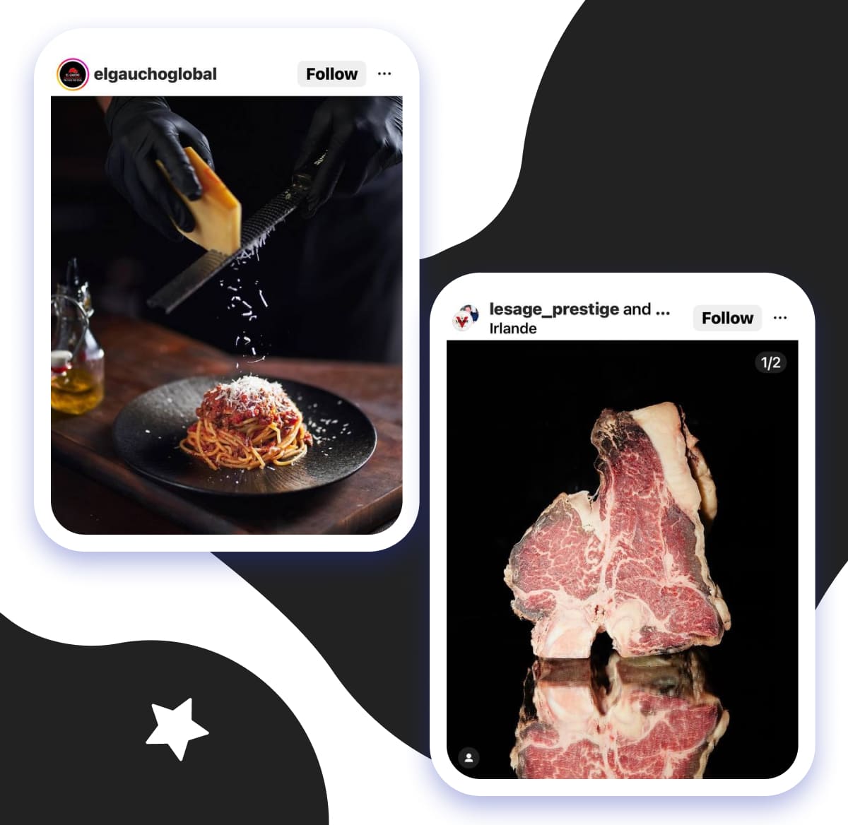
Red and orange are often seen as ‘appetizing’ colors. Black plates highlight food colors, which intensifies the perception of flavor. By the way, black backgrounds are often used in food photography, particularly for dishes served hot — like steaks, fish, or pasta.
Color in Interior Design: Psychological Effect
Different hues have psychological effects that can enhance the purpose of a room or venue.
For example, blue is commonly associated with calmness and tranquility. Therefore, it’s a great choice for bedrooms and spas, where relaxation is key.
Green symbolizes nature and balance and is great for spaces like living rooms, libraries, and wellness areas. It helps create a peaceful, stress-free atmosphere.
Red, on the other hand, is energizing and stimulating, which makes it a good choice for spaces where people come for activity or conversation. Think of theaters, restaurants, and cafes.
Yellow evokes feelings of warmth and happiness, so it works well in kitchens and playrooms. If you’re seeking to create an inviting and cheerful vibe, warm yellow is an ideal choice.
Gray and beige are neutral, yet more sophisticated tones. They are perfect for living rooms and offices as they provide a calming setting that doesn’t overwhelm one’s senses.
Social Media: How Color Influences Engagement
Research indicates that social media profiles’ visual elements, especially color, can significantly impact user engagement metrics. Here are some findings from academic studies that social media marketers can apply to improve their strategies.
1. “Standing Out from the Crowd: When and Why Color Complexity in Social Media Images Increases User Engagement”. The study explores how colors affect social media performance, particularly in terms of user engagement.
The researchers used proprietary Facebook datasets and biometrics eye-tracking. Their study revealed that images with high color complexity — meaning greater pixel-level color variation — captured more user attention than simpler visuals.
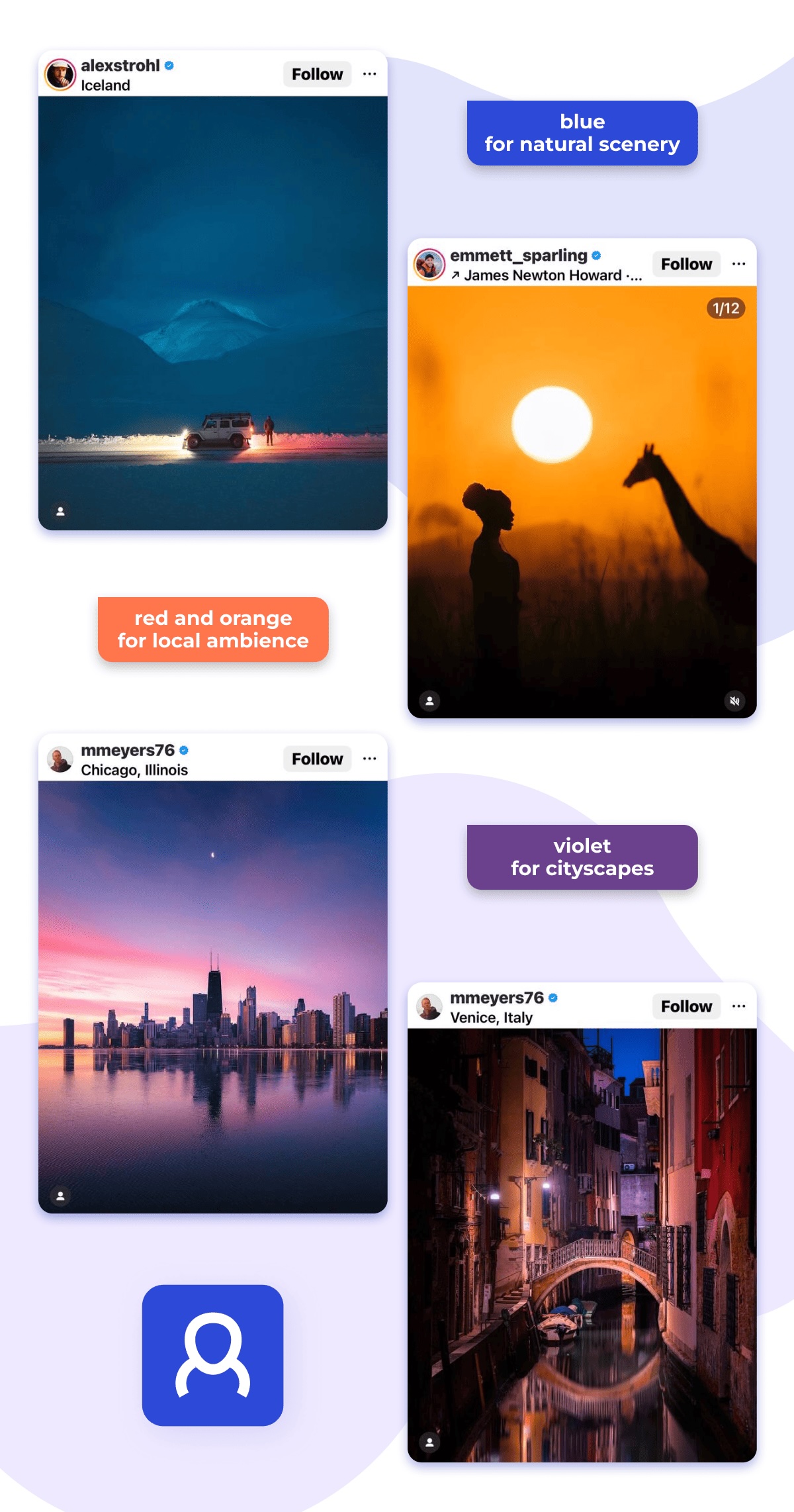
2. “Color and Engagement in Touristic Instagram Pictures: A Machine Learning Approach”. The authors came up with several fascinating findings:
- photos featuring natural scenery, high-end gastronomy, and sacral architecture benefit from the presence of blue, which enhances user engagement;
- red and orange boost engagement with images featuring local delicacies and ambience;
- violet accompanied by warm colors is important for images featuring cityscapes and interior design.
3. “Brand Communication in Social Media: The Use of Image Colours in Popular Posts” is another paper dedicated to the connection between color psychology and social media engagement. The team of authors explored brand posts on Facebook and came to a conclusion that black, gray and brown colors were more often used in images of popular brand-related posts.
While these studies don’t cover the full spectrum of how color influences user behavior on socials, they clearly show that color psychology in social networks is a serious, research-backed topic.
Marketers, designers, and content creators can benefit from understanding these principles and working out smarter strategies.
Tips for Choosing the Right Color Palette for Instagram
Your goal is to make your brand noticeable and recognizable, and your Instagram color palette plays an important role in that.
As much as the choice of your Instagram color scheme can reflect your personal color preferences, it should be influenced by other factors, such as:
- your brand colors
- your industry
- your Instagram theme
- your target audience
If you’re running a law firm, you likely don’t want your grid to be all neon green and hot pink. Elegant black, navy, or deep indigo will communicate the vibe of trust, reliability, and professionalism.
But if you’re managing an account for a trampoline venue or a kids’ activity center, don’t hesitate to break out orange, red, or yellow. They convey the feeling of excitement and fun — inviting visitors to ‘bounce here and now’.
So, how do you actually use color psychology in Instagram marketing the right way? Here are some tips.
1. Define Your Brand Mood
What emotions and values do you want to convey? Select colors that resonate with the essence of what your brand represents.
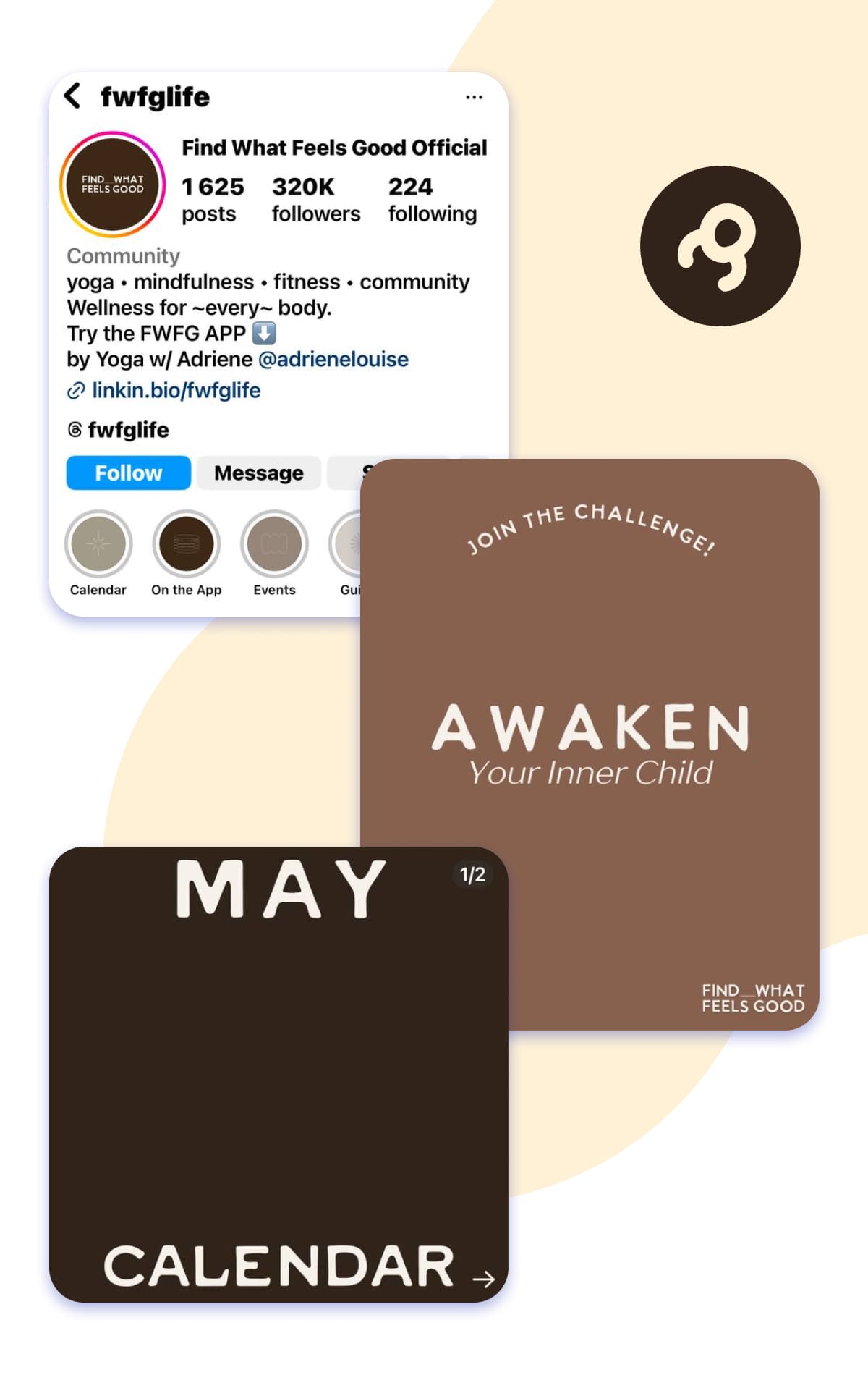
For example, if it centers around yoga, think of soothing neutrals and pastels. They evoke feelings of tranquility, harmony, and relaxation — all of which perfectly mirror the principles of yoga.
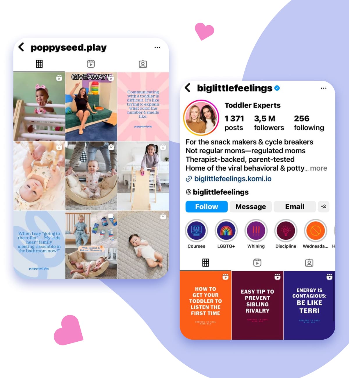
Running a parenting-focused page? It’s totally fine to use “baby colors” such as soft pink and blue. They’re familiar and intuitively expected. Alternatively, bright cartoon-style colors will also do.
Selling home-made desserts? Go for bold Instagram colors like cherry red, lemon yellow, or blueberry blue to make your sweet treats pop off the screen.
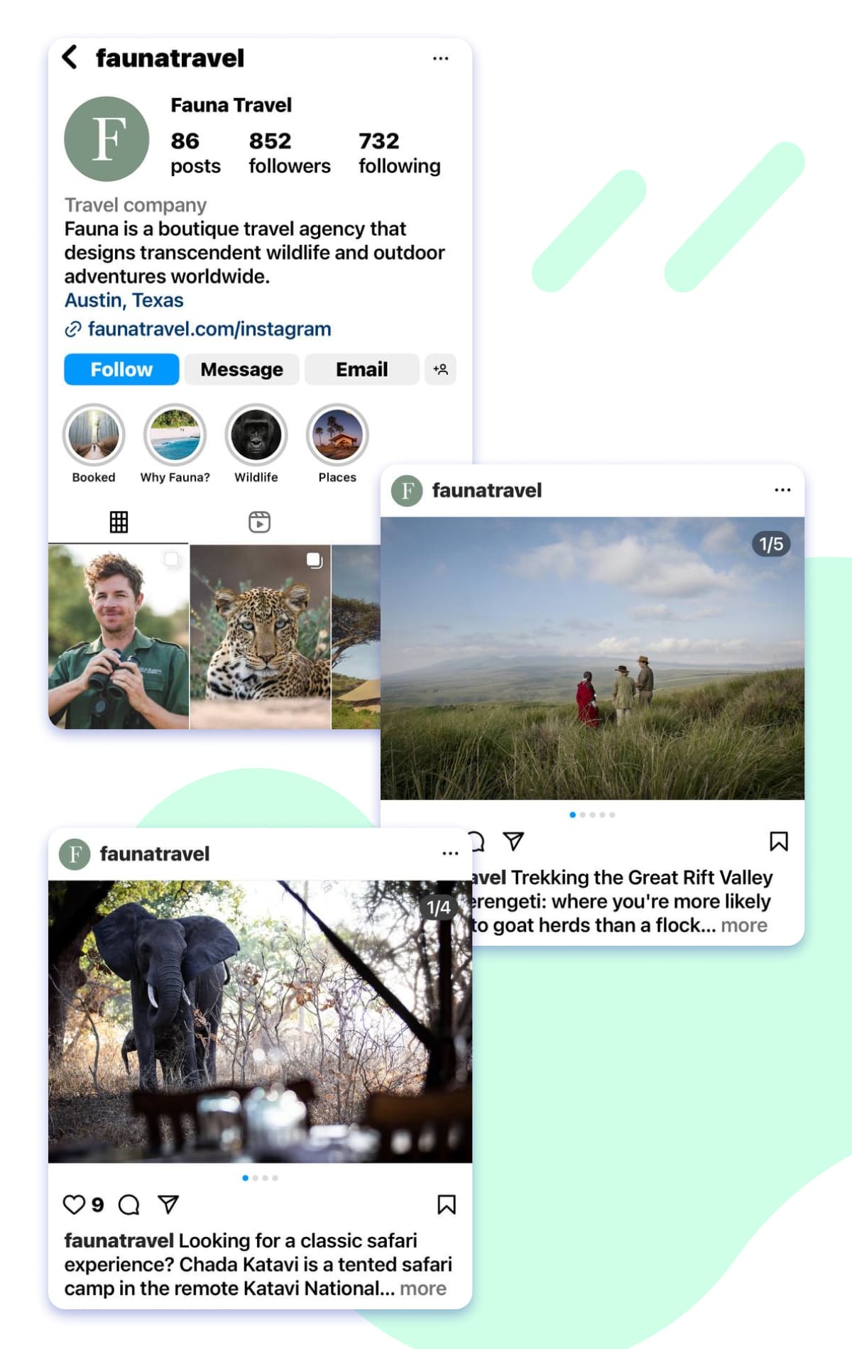
Accounts promoting wildlife tours or nature retreats should lean into natural, earthy tones. Terracotta, ochre, charcoal, sage, and umber are the hues to go for if you want to emphasize your connection with environment and adventure.
2. Be Consistent
Life is about change, so you don’t have to stick to the same color palette forever. However, maintaining consistency in how your grid looks will benefit your account and followers’ loyalty.
A picture is worth a thousand words — so let’s take a look at a couple of truly fascinating Instagram grids.
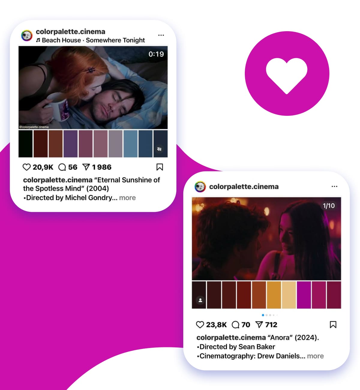
This account demonstrates how color can be a powerful storytelling tool. Each post visualizes the atmosphere conveyed in a movie scene pairing it with the relevant color palette, which makes the feed a genuine eye-catcher:
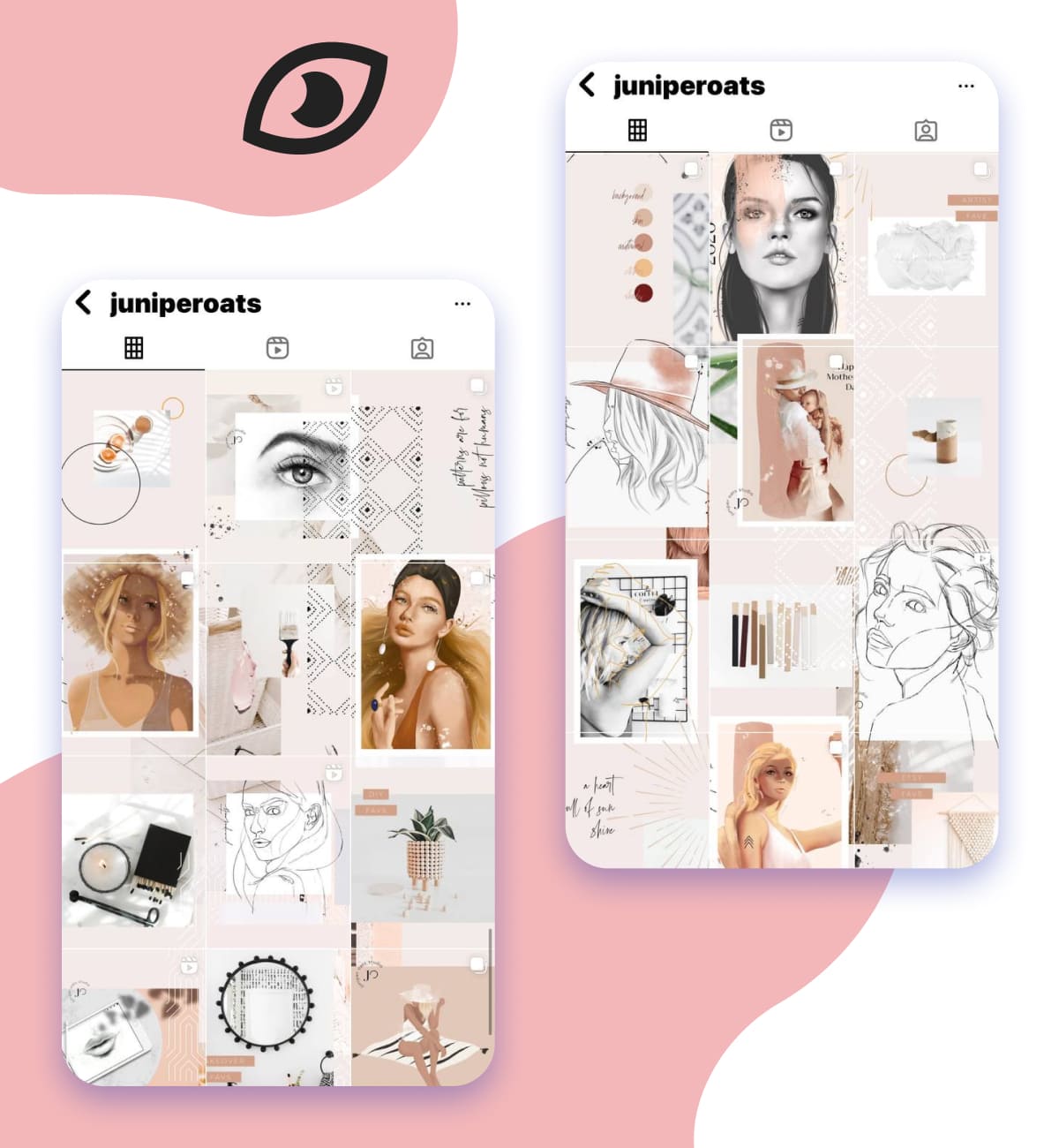
Check out another Instagram account — we bet it’ll grab your attention. While every single picture in the grid makes you gaze at it, together they form a fancy mosaic.
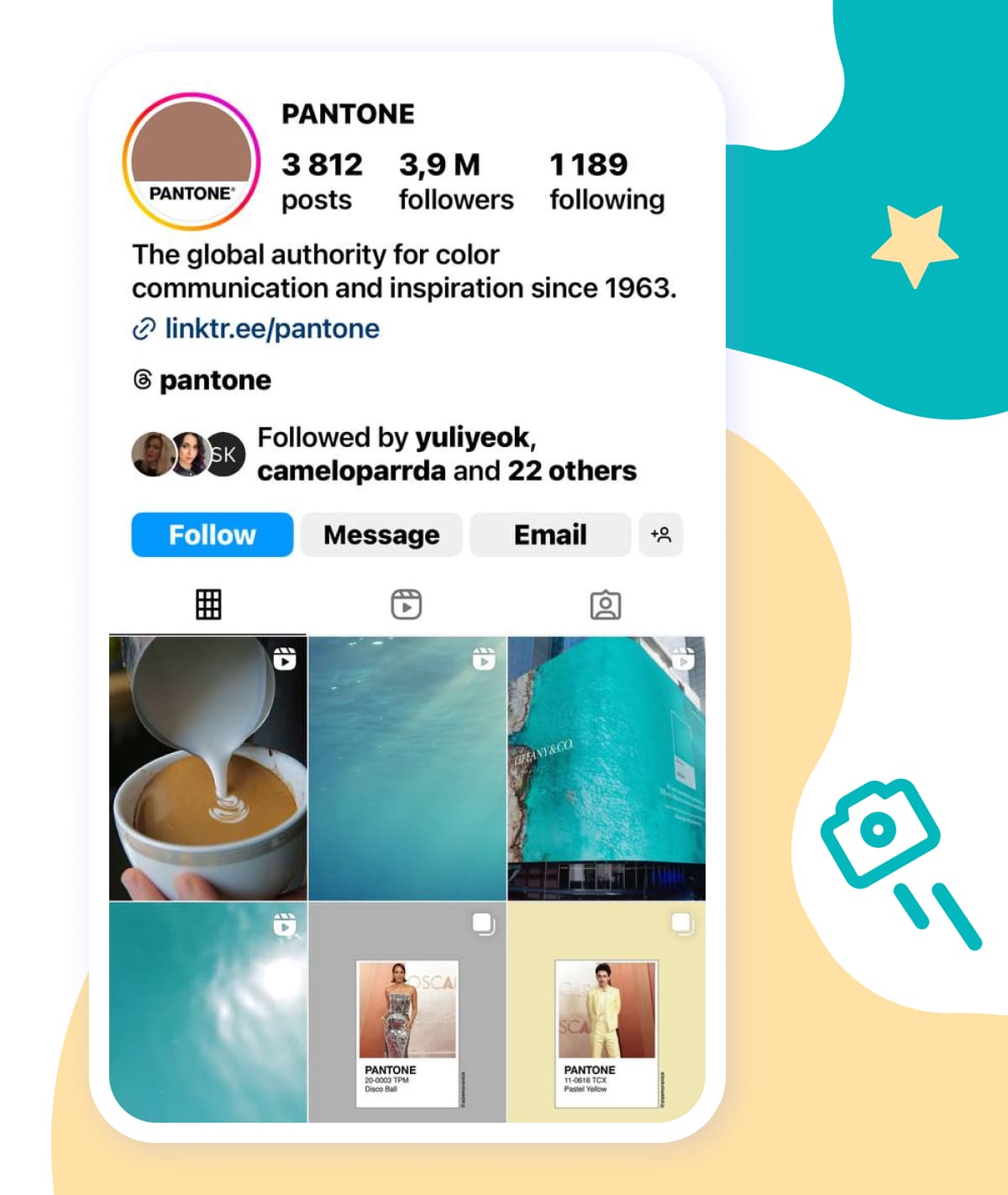
Of course, we can’t leave out Pantone, the brand that tells the world what colors to admire each year. Their Instagram grid is another example of visual consistency.
Pantone is utilizing vibrant hues to showcase their color expertise and build a connection with designers and artists.
3. Consider Your Audience
What works for a tattoo salon’s Instagram account will hardly suit a lady selling knitwear, right? So, when choosing the colors that will represent your digital showroom, studio, or any other space, keep your target audience in mind.
For example, a bright and playful palette might appeal to a younger, more energetic crowd. Elegant tones could resonate better with a more refined and sophisticated audience.
Types of Instagram Color Palettes with Real-Life Examples
Color theory, or the study of how colors work together, is used in a variety of life spheres, and social media is not an exception. The same well-known color schemes can be applied effectively to curate your Instagram page, too.
Monochromatic Color Palette
Monochromatic color palettes, as the name suggests, include one color. Or, to be precise, different tones and hues of one color. Coca-Cola’s red has become a classical example of how brands can stick to just one tint.
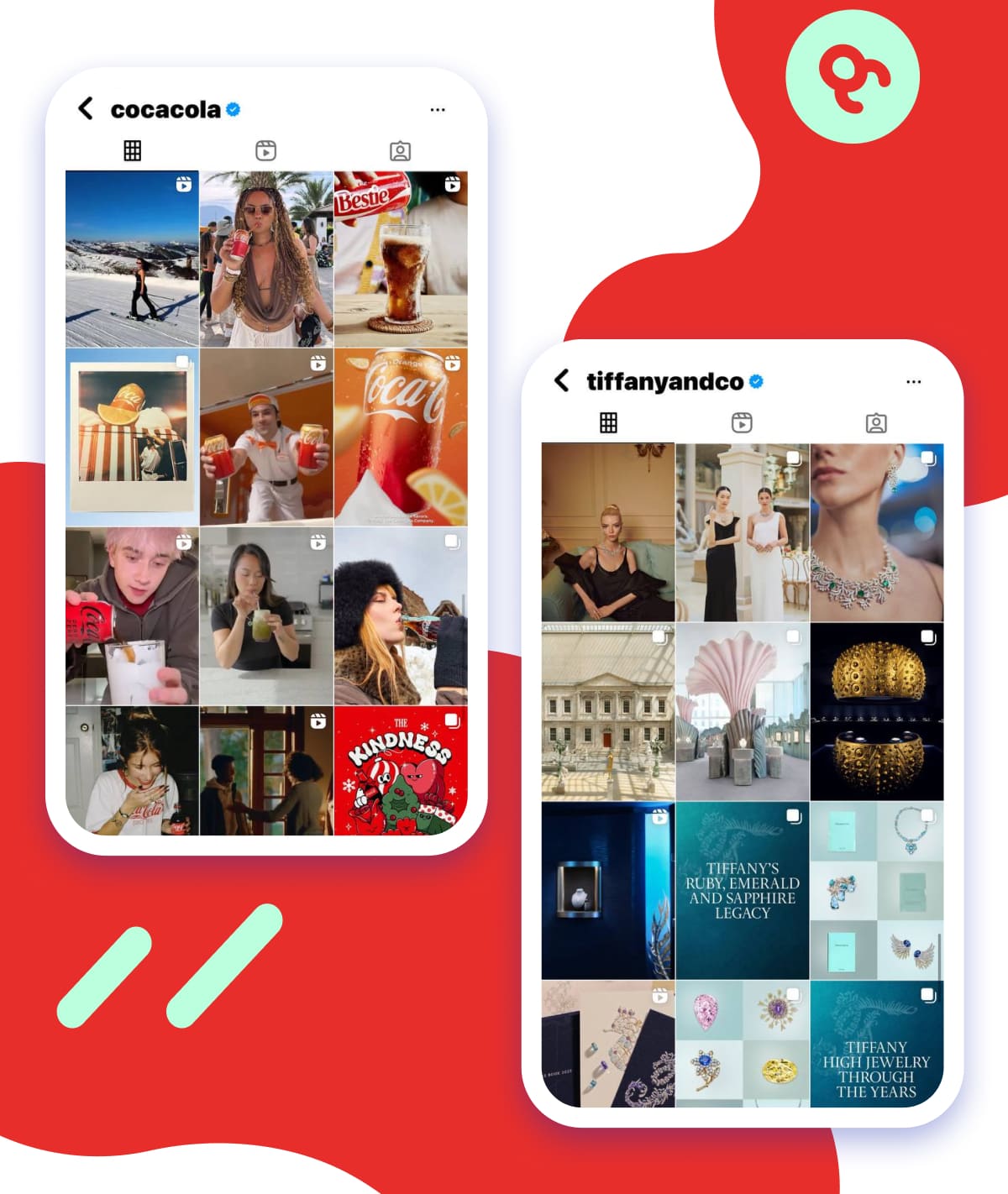
Another example is Tiffany blue — the company’s signature hue inspired by the color of the robin’s egg.
If you want your brand to be associated with a single color, a monochromatic palette is your best option. While it leaves little room for playing with other colors, it’ll definitely contribute to your brand awareness.
Analogous Color Palette
Analogous color palettes are made up of colors that are located next to each other on the color wheel. These colors are closely related and create a harmonious look.
For example, blue, teal, mint, jade, and green form an analogous palette. To create one for your Instagram account, choose a base color and select two adjacent on the color wheel.
Complementary Color Palette
Complementary color palettes feature two colors that sit opposite each other on the color wheel. A famous example is orange and blue — think again of Bill Murray’s beanie contrasted with the ocean in Wes Anderson’s film.

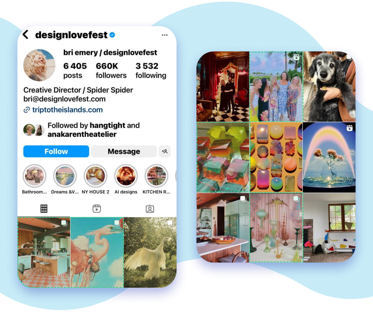
But let’s bring it back to social media. Bri Emery’s Instagram account colors include coral, green, and mint, which create a playful grid. She uses other colors too, but coral and mint seem to be her signature tints.
Triadic Color Palette
A triadic color palette consists of three colors that are evenly spaced around the color wheel. A textbook example is the combination of red, yellow, and blue.
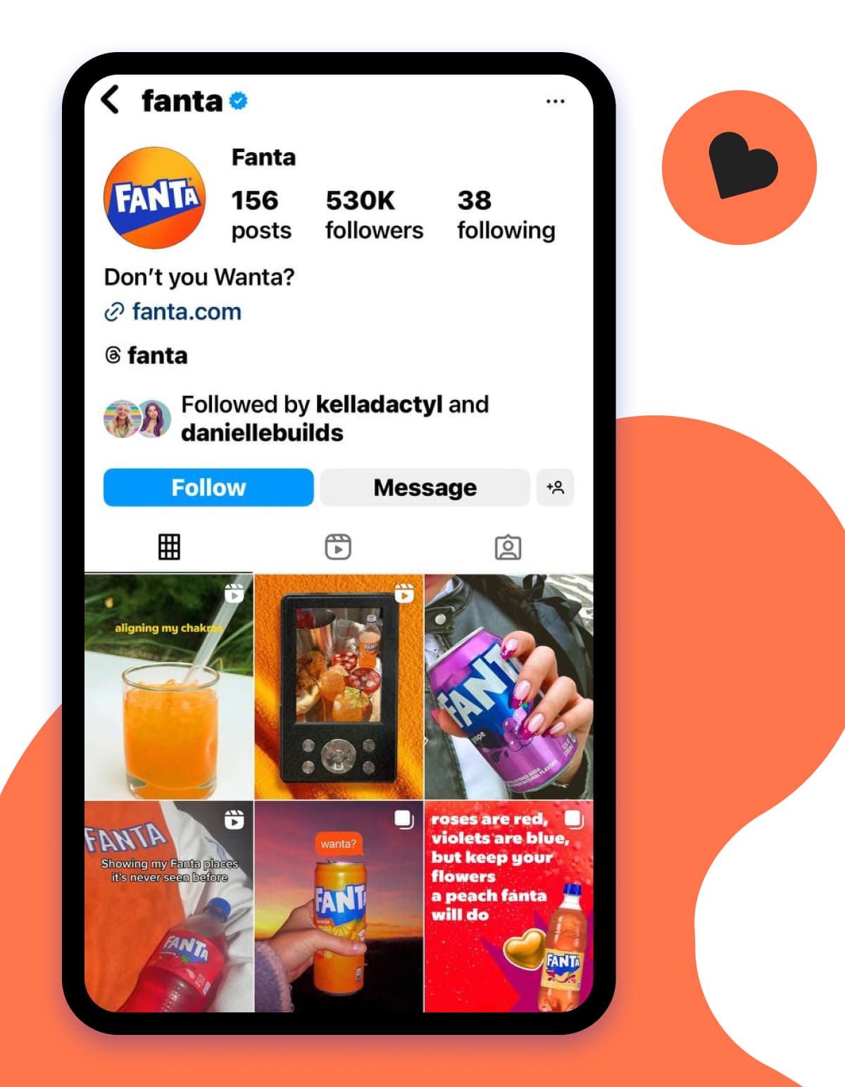
You may think of other variations, though. For example, Fanta uses a blend of red-orange, yellow, and blue to create its lively branding.
Using the Instagram Profile Analyzer to Evaluate Your Aesthetic
To understand how your visual strategy — especially the way you use your Instagram feed color palette — is performing, utilize the Instagram Profile Analyzer.
It’s a practical tool that’ll help you track the following key metrics:
1. Engagement rate
You can measure how well your content connects with followers. Experiment with different color schemes, color combinations, and styles and try to derive a pattern in user interactions with your posts. This color analysis will help you tweak your visual strategy.
2. Follower growth
This exercise may take time, but it’ll be time well spent. Implement some visual updates in your Instagram branding — like crafting new Highlights covers or refreshing the grid — and track how it’ll affect your audience size.
3. Top-performing posts
Examine your best-performing posts and pay attention to their designs and dominant colors. Is there a direct correlation between the color and the number of likes? If yes, you might want to pursue that successful color palette.
4. Average user activity
Assess how your content is performing — are people reading and commenting? Or are they just skipping past? If you’re not seeing the desired results, adjust your color strategy and track the impact over time. Has anything improved? If so, it may be your new approach that’s making all the difference.
5. A major bonus: you can analyze other public accounts
Use Instagram Profile Analyzer to research competitors, niche leaders, or simply accounts with aesthetics you like. Compare their visual content with yours to identify what’s working in your area and what you can improve.
Let’s draw the bottom line. With the Instagram Profile Analyzer, you can do the following:
- Understand which color schemes resonate most with your audience;
- Monitor changes in engagement metrics as you adjust your color palette;
- Analyze Instagram profiles, grab freshideas and refine your visual strategy.

How do you use the tool? You don’t need to install any apps. Simply open the tool’s page, input an Instagram username or page link, review the breakdown of fourteen different metrics, and use the insights to supercharge your visuals strategy.
Conclusion
Color fills our lives with emotions and vibe. It makes the world bright and shining. Color can tell people about our mood and feelings. And, it’s not just about aesthetics — color can play a big role in how people connect with you online. It’s instrumental for promoting your business via social media. The right Instagram color palette is one of the factors that contribute to account growth. If you’re not sure where to start, our Instagram profile analyzer can give you insights and help you shape your visual strategy on the platform.
Frequently Asked Questions
How do I choose a color palette for Instagram?
To create an effective color palette for your Instagram account, you should take into consideration several important factors. Along with your brand identity, they include your Instagram theme, your business niche, and your target audience. A great color scheme embraces not only aesthetics — it’s also about strategy. Use color psychology to understand how different colors affect emotions, mood, and perception. Apply color theory to ensure your chosen colors work well together.
What colors attract attention on social media?
Bright and neon colors are eye-catching and tend to attract the most attention on both social media and in other visual spaces. However, attention alone is not enough. When choosing your social media color palette, make sure it resonates with your brand identity, reflects your industry, and communicates the purpose of your content.